I can remember the first time I found the sales dashboard of my Seller Central account. It took me back to the first time I saw the dashboard of a Boeing airplane.
My brain curled up in a fetal position and sobbed quietly.
Too many choices. Too many buttons. Too many blinking lights. I just couldn’t believe a pilot could process all of that information, and even if someone wanted to learn how to fly, where in the world would you begin? Which of the 1,480 buttons would you start with?
In other words, it was an overwhelming experience, which is why the word “dashboard” still sends me into panic mode when I see it. But apparently, it’s a common word for software interfaces, and as of yet, no techie has responded to my emails to call them “switchboards”.
The problem is that I’m not an analytics guy. I’m more on the creative end of the spectrum, so spreadsheets and graphs and charts and dashboards - they all intimidate me. And for a long time, my strategy for handling those things was the same one I use when facing an angry dog: (1) Don’t let them smell your fear, and (2) run for your life.
I don’t want that to happen to you. I don’t want you to avoid your Seller Central tools just because it’s dark and scary and leaves you breathing into a paper bag. Seller Central was created for you, the seller, and contains valuable tools to help you track and monitor your Amazon business.
Thankfully, once you start to look at each individual option instead of the entire dashboard, you’ll see that your sales dashboard is quite user-friendly. And the more you are able to navigate the backend of your Seller Central account, the more information you’ll have to analyze and make better business choices.
In this article, I’m going to make the sales dashboard as accessible as possible. Now even though you can see multiple product stats in the dashboard, I’ve created this guide for someone selling only one product. This will make things a bit simpler for the tutorial.
So hold my hand firmly and let’s walk through this dashboard thing together. One simple step at a time.
And don’t let it smell your fear. Dashboards can sense fear a mile away.
NAVIGATING YOUR SALES DASHBOARD ON SELLER CENTRAL
1. HOW TO FIND YOUR SALES DASHBOARD
Once you’ve logged on to your Seller Central account, scroll down to your Sales Summary section on the right side of your page. Then click on “View more of your sales statistics”.

2. THREE MAIN FEATURES ON YOUR SALES DASHBOARD HOME PAGE
When you first arrive on your sales dashboard, you need to be aware of three main features on the page:
First, notice the menu bar on the left side of the page.

We’ll be navigating this menu bar in a minute, but for now, simply be aware that we’ll be able to all of our sales stats under the Business Reports section of the menu bar.
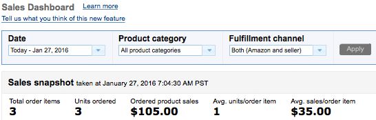
Second, notice you are given a quick Sales Snapshot directly in front of you. Here you can see your orders for the day, how many units were sold, and the amount of sales revenue you’ve generated for the day.
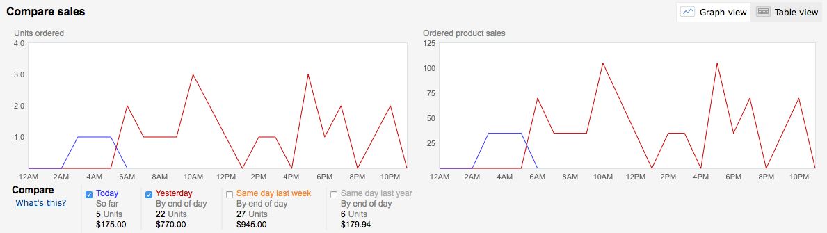
Third, you’ll also be given a Compare Sales graph below the Sales Snapshot. This allows you to compare today’s sales with other sales days.
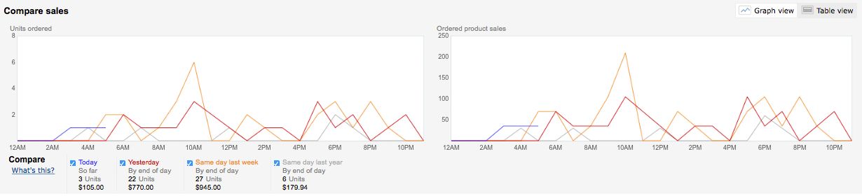
If you’d like to remove one of the comparison graph lines, simply uncheck the box next to that sales day. The graph will now show only the selected statistics.
Your Compare Sales graph allows you the ability to track sales trends and make simple comparisons. If you notice your sales are slow today, you can quickly see if your sales were slow on the same day last week or last year.
3. USING THE SALES REPORT MENU
The menu on the left side provides you access to lots of different sales statistics. You might be a little overwhelmed when you try to make a distinction between all the different report options, but it’s not as complicated as it seems.
The menu offers you three ways to arrange your statistics: By Date, By ASIN, and Other. Since we’re assuming you only have one product for now, we’ll focus on the “By Date” section.
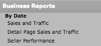
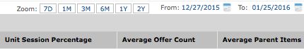
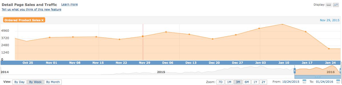
The three report options under “By Date” all offer various statistics arranged into columns. For instance if you click on “Detail Page Sales and Traffic”, you’ll be given this information:

The data offered in this report focuses on your sales and your page traffic. However, on any of these report pages, you can customize the data you want to see. Simply hover your mouse over the right side of the screen, and a Columns customization box will appear.

Now you can simply check or uncheck the data columns you want to see, and your report will automatically reload and update.
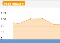
By default, the graph at the top of my page is set to show my “Page Views” for the last 30 days, but you can also customize the graph to chart other data or different time periods.
Removing or Adding Data to Your Graph
To remove an item from your graph, simply click on the “x” next to the statistic name at the top of the chart.
To add data to your graph, click on the column header name and choose “Add To Graph”.
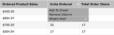
If you’re not sure what the data in a specific column is referencing, you can easily click on the column header name and choose “What’s this?” A simple description will appear.

You can add multiple data columns to your graph, and each column will be distinguished by a different colored line.
Changing the Date Range on the Graph
By default, the columns and the graph will show you stats for the last 30 days, but this is also customizable. To change the date range on your stats or chart, you have four different options.
First, you can choose from the “View” tabs above the left corner of the data table (next to the word “View”).
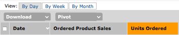
Here you can choose to see data by day, by week, or by month. Whenever you make a selection, the graph and report will automatically update.
Second, you can also change the date range by choosing from the “Zoom” tabs near the top right side of the data table.
Here, you can choose to arrange data by 7D (last 7 days), 1M (1 month), 3M (months), 6M (6 months), 1Y (1 year), or 2Y (2 years). Again, the graph and report will automatically update when you make your selection.
Third, you can select a specific date range by choosing from the “From” and “To” options at the far right corner of the data table (next to the Zoom tabs). When you click on the “From” or “To” options, a calendar will appear, allowing you to make a selection:

Once you’ve chosen a “From” and “To” date, your data table and graph will automatically update.
And yet, if you are somehow not content with those three methods of changing the date range, there is a fourth way. Simply drag the slider above the “To” and “From” section to the date range you wish to see.
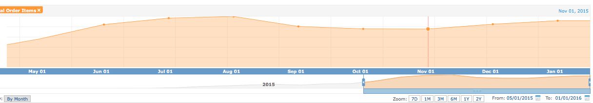
By customizing the graph to include specific data and date range, you can get a clearer picture of your sales, listing traffic, seller feedback, and lots more. For instance, here’s a simple graph showing sales revenue for a three month time period. All I had to do to create it was add the “Ordered Product Sales” column to the graph and click on the “3M” Zoom tab.
And boom! Now I can spot sales trends in the last three months that may help me track future revenue as well.
4. DOWNLOAD YOUR REPORT INFORMATION
If you want to pack up your statistics in a doggy bag to take back home, simply click on the “Download” button above the left corner of the data table, then choose “CSV”.
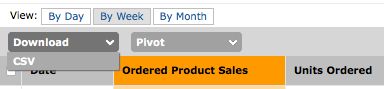
Your report will automatically begin to download and will be named “Business Report-(today’s date)”.
Conclusion
For some Amazon sellers, their Seller Central account could be reduced down to a current sales number for the day and their seller feedback portal. But Seller Central can provide some powerful tools to quickly generate valuable information about your business.
Hopefully, you can now see that your sales dashboard’s bark is worse than its bite. You can look that dashboard right in the eyes and say, “Down, boy!” And once you show it who’s boss, you’ll be able to teach it lots of new tricks and find a friend you’ll grow to love.
With this introductory guide to your sales dashboard, you’re on your way to becoming an expert Seller Central navigator, and that skill will set you apart from other sellers just “hoping” their way to the top. So start tapping into this awesome resource, generate your stats, analyze your reports, then plan your future with confidence.
If you're just getting started selling on Amazon it's incredibly important to maximize the effect of your early sales. One way to maximize the effect of your sales is to use Salesbacker which can help you get more product reviews. Try Salesbacker for free today.